
Ditched the Drink
Sober Coach Heather Lowe
Brand identity, social templates, and course workbooks.
Client
Heather Lowe
Year
2023

It was time to lay down the crown.
Heather and I met on Instagram, where I illustrated her for The Sober Illustrator and we knew right away that we loved working together, so I was so happy when she asked me to tackle her rebrand.
Her old mark was a crown, and it had served her for a while. A crown is about arriving somewhere and being elevated and becoming the highest version of yourself, which are lovely promises, but often not something someone who is just quitting alcohol is able to envision for themselves.
It was also carrying more than one mark can carry. Nothing in it said drinking, so the name had to explain the entire business by itself, and it had drifted into two different color moods depending on where you found it, which is sometimes what happens to a brand that grows faster than it gets looked at, and Heather's had grown a lot.

Heather coaches high-achieving women. Executives, caregivers, business owners, women who look completely fine from the outside but are often longing for more. Her own description sums it up perfectly: she's not an alcoholic, she's just over it. No rock bottom required, no label, no shame about any of it, just onward to a new and more fulfilling path.
What we made
A cocktail glass, tipped over, with flowers spilling out of it instead of liquid.
The idea was that while you're pouring one thing out of your life you're bringing all this magic and wonder and whimsy into it. So instead of a crown waiting at the end of the journey, we're looking at the moment of the pour itself, and at the fact that what comes out isn't loss at all.
It also answers the fear that's actually there. Nobody worries that sobriety will be bad for them, they worry that it'll be boring and small and beige. A glass full of flowers argues with that before anyone has read a single word.
The type is borrowed on purpose
It's a high-contrast deco serif, which is the register of cocktail menus and liquor labels and hotel bars, and that is very much the point.
Someone thinking about making this change is often half convinced that the aesthetic gets worse. That she's trading a beautiful wine bar for a church basement and inspirational quotes printed over sunsets. Taking the alcohol industry's own typography and handing it to a sobriety coach felt like a small reclamation, and what it says is that the glamour comes with you.
Built for a woman with a lot of doors
Heather does not have one offer. She has a membership, private coaching, a business mentorship arm for women who want to become coaches themselves, a self-paced course, two podcasts, retreats, and workplace consulting. (She is a marvel.)
A single logo would have started falling apart almost immediately, so she got a system instead.
"Love your talent and undeniable style, but I really love working with you because you read my mind, calm me down, and somehow get me even when I don't."
—Heather Lowe, Ditched the Drink
Then the workbooks
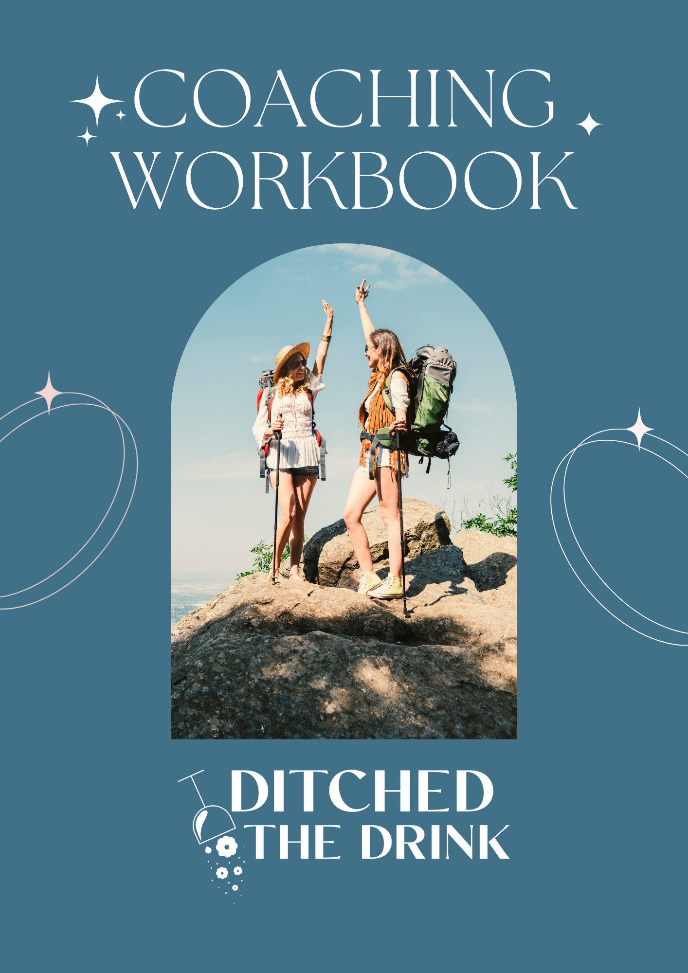
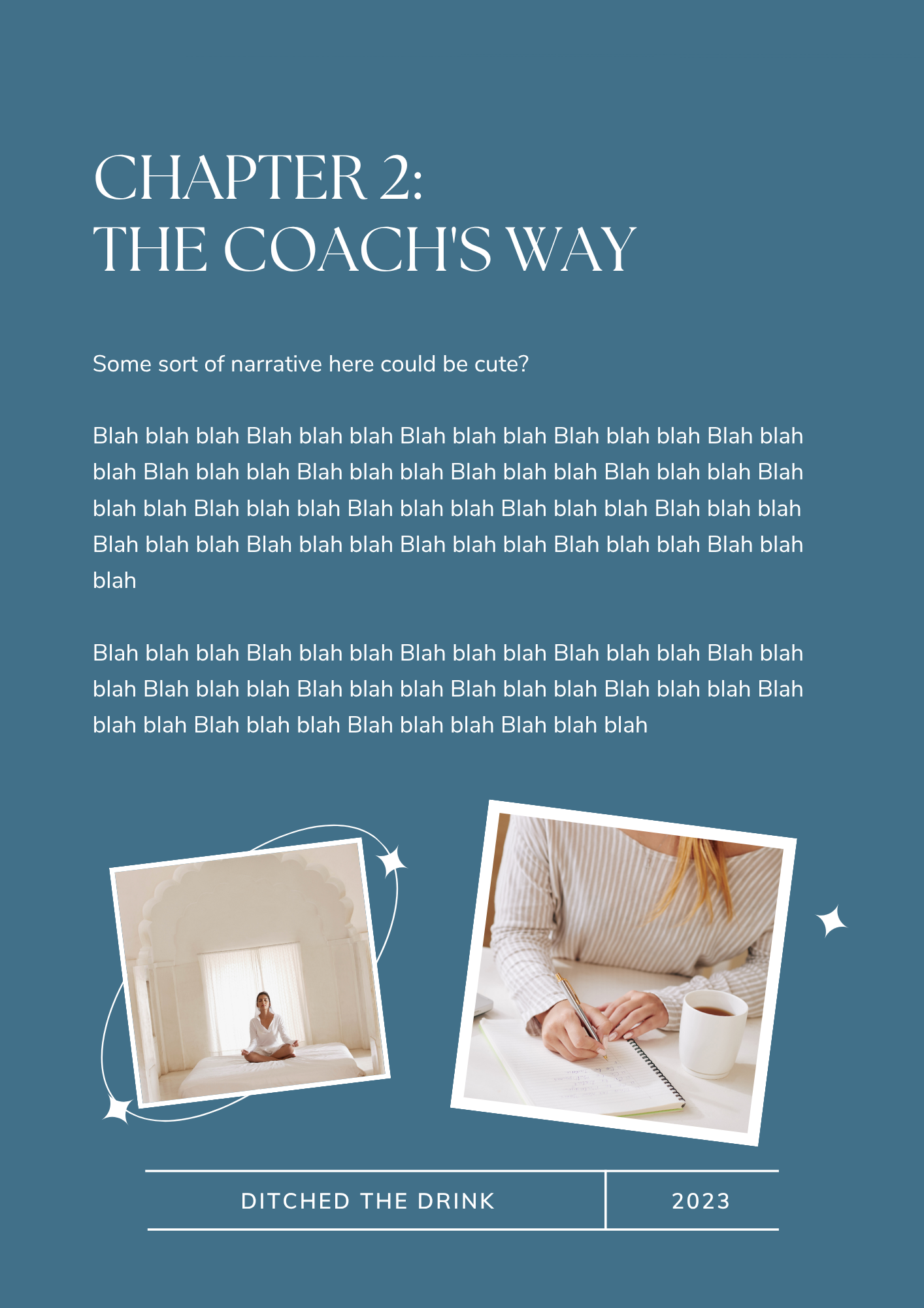
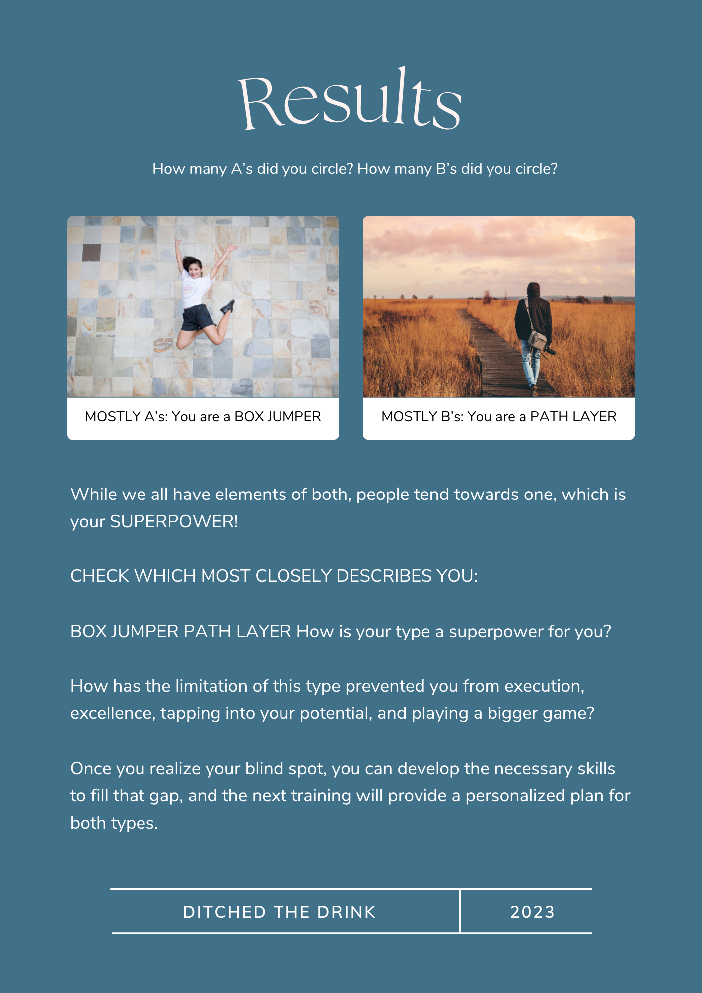
I designed a series of workbooks for her online course, plus her social template system, and this was the part I had the most fun with. They're templates rather than finished documents, which you can tell because the placeholder copy still says "blah blah blah" and "some sort of narrative here could be cute?"
What I'd tell you about it.
Branding a person is harder than branding a place. A bar has an address and a menu. A coach has only herself, so everything you make has to sound like her rather than sounding like design.
The real test is whether she can keep making things without me, and Heather has been making things nonstop ever since, and it all still holds together. She just won Coach of the Year at the Sans Bar Academy Awards (no big deal).