
The Teetotalist
Zero-Proof Social Club
Brand identity, menus, signage design, and social, built across two years as a pop-up became a permanent room.
Client
Amanda Brincat and Kathryn Altman
Year
2023
They needed a brand before they had a building.
Amanda and Kathryn found me on Instagram in November 2022. They had a pop-up booked for three weekends and needed something to put on a sign.
They'd made something themselves already. It was pretty and it could have belonged to a speakeasy in any city in the country.

They already knew who they were for
The most useful thing in their intake form was one sentence about their audience: women 25 to 40 with money to spend on going out, and, in their words, "although we will be an alcohol free space, we do not expect to cater only to the sober crowd."
That's not a sober bar. That's a bar, for people who want a night out, some of whom don't drink. They wanted it to be somewhere LGBTQ+, BIPOC, and women felt they had a community, and they described the personality they were after as fun, daring, inspirational, cheerful, and trendy.
Not one of those words is calm.
Which matters, because most branding in this space defaults to daylight. Soft palettes, botanicals, the visual vocabulary of a juice bar. It's well-intentioned and it confirms the exact thing people are worried about, which is that sobriety means the fun ended. But nobody goes to a bar at two in the afternoon.
The mark
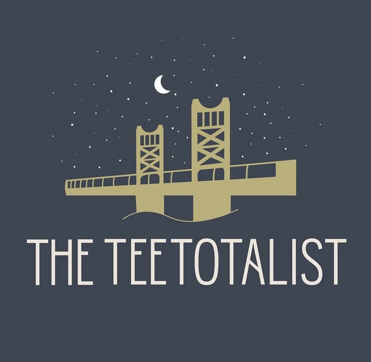
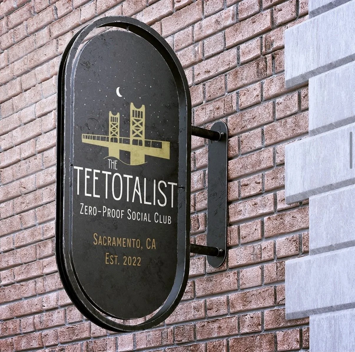
A night sky, a moon, and the Tower Bridge lit up gold. Sacramento's bridge is already that color, so the palette was inherited from the city rather than chosen.
The bridge was my addition. They hadn't asked for a landmark, and putting one in a mark ties you to a place permanently. But a pop-up with no address needs to belong somewhere.
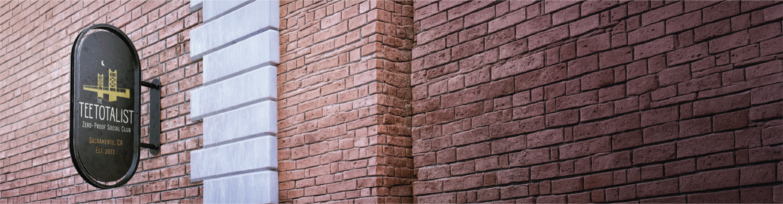
"We had so many compliments on our signage this weekend. We are still blown away by what you put together."
— Owner, Amanda Brincat
Then I built everything else.
A bar generates an enormous amount of material. Drinks change. Hours change. Events get announced on three days' notice. If every one of those is a new design decision, the brand dissolves within a month, usually into whatever template was closest to hand at 11pm.
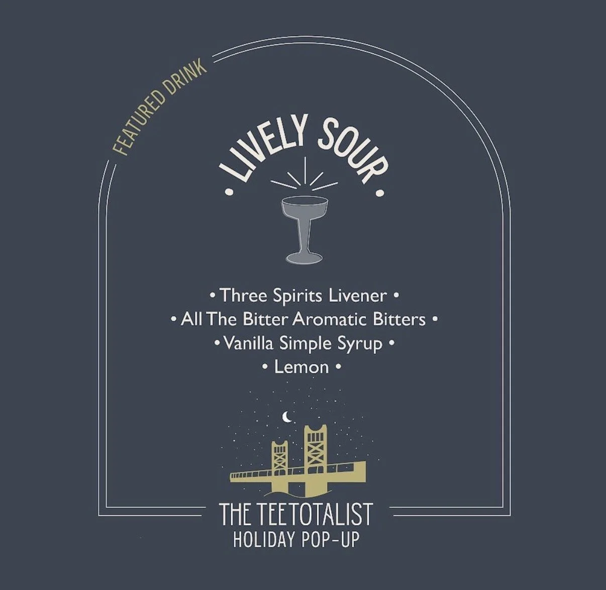
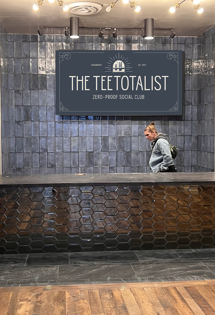
So the whole system runs on one shape. The arch that frames the logo also frames the drink cards, the hours posts, and the menus. It came out of their original lettering, so it was already theirs.
What I'd tell you about it.
The interesting problem wasn't drawing a bridge. It was building something that had to work at a folding table one month and a brick storefront the next. A brand for a business like that isn't a logo. It's a set of decisions made in advance so that nobody has to make them again at eleven at night before a Saturday event.
"Your work is amazing and you've helped us level up and become more professional. We are continuously impressed with you!"
— Owner, Kathryn Altman